

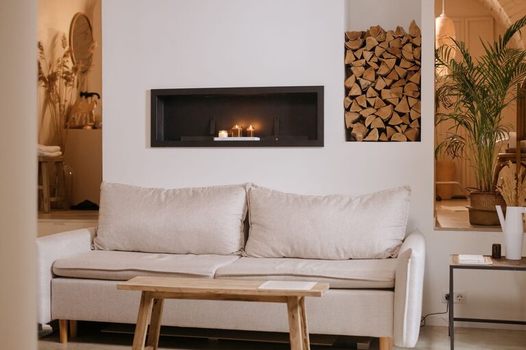
Choosing calm colors for your home can make each room feel more comfortable, welcoming, and easy to live in. Soft shades can help create a restful bedroom, a relaxed living room, or a bright and peaceful entryway. However, choosing the right color is about more than picking the palest paint on the shelf.
The size of the room, natural light, furniture, flooring, and nearby colors all affect how a shade looks. With a thoughtful approach, you can create a calm color palette that feels personal without becoming dull.
Start With the Feeling You Want
Before choosing specific colors, think about how you want the room to feel. Calm colors are often associated with comfort, balance, and quiet, but different shades can create different moods.
For example:
– Soft blue can feel fresh, open, and restful.
– Gentle green can bring a natural, grounded feeling.
– Warm beige can make a room feel cozy and inviting.
– Muted gray can create a simple, modern atmosphere.
– Soft white can make a space feel clean and airy.
– Dusty lavender can add a quiet touch of color without feeling bright.
Consider the purpose of the room. A bedroom may benefit from cool, muted shades, while a living room may feel more welcoming with warm neutrals. A home office could use a soft green or blue-gray to create a focused but comfortable setting.
Understand the Difference Between Warm and Cool Colors
One of the easiest ways to build a calm color scheme is to understand color temperature.
Warm colors include shades with hints of yellow, red, or orange. Warm whites, creamy beige, sand, and soft terracotta can make a room feel comfortable and welcoming.
Cool colors include shades with hints of blue, green, or violet. Pale blue, sage green, blue-gray, and cool white can make a room feel fresh and peaceful.
Neither group is automatically better. The best choice depends on the room and the atmosphere you prefer. A room with limited sunlight may feel more inviting with warm colors. A bright, sunny room may work well with cooler shades that balance the strong natural light.
You can also combine warm and cool colors. For example, a soft blue wall can work with warm wood furniture, while a beige room can be refreshed with sage green fabrics.
Pay Attention to Natural Light
Lighting can change the appearance of a color throughout the day. A shade that looks soft and neutral in the morning may appear warmer in the afternoon or darker at night.
Before committing to a color, observe the room at different times:
– Morning light may make colors look cooler or brighter.
– Afternoon sunlight can bring out warm undertones.
– Evening lamps may make some colors appear yellow or deeper.
– Rooms with little natural light may make colors look more muted.
Place sample boards or large painted test areas on different walls. Avoid judging a color from a small card alone. A larger sample gives you a better idea of how the color will interact with the room.
If possible, leave the samples in place for at least a day. Look at them in natural light and under the lamps you normally use.
Choose Muted Shades for a Softer Look
Bright colors can be attractive, but highly saturated shades may feel energetic rather than calm. If you like a particular color, look for a softened or muted version.
For example:
– Choose dusty blue instead of bright royal blue.
– Try sage instead of vivid green.
– Select blush or clay instead of strong pink.
– Use warm ivory instead of sharp white.
– Consider mushroom or greige instead of a dark gray.
Muted shades contain less visual intensity, which makes them easier to use across large areas. They also tend to work well with natural materials such as wood, linen, cotton, rattan, and stone.
Build a Simple Color Palette
A calm home does not need to use one color everywhere. Instead, create a connected palette with a main color, supporting shades, and small accents.
A simple approach is the 60-30-10 rule:
– Use one main color for about 60 percent of the room.
– Add a secondary color for about 30 percent.
– Use an accent color for the remaining 10 percent.
The main color might appear on walls and large furnishings. The secondary color can be used for curtains, rugs, or upholstery. Accent colors can appear in pillows, artwork, ceramics, or small decorative pieces.
For a peaceful palette, keep the accent color muted and use it sparingly. For example, pair warm white walls with beige furniture and touches of soft olive. Another option is pale blue walls, natural wood, and small accents in sandy tan.
Consider the Colors Already in the Room
Paint is only one part of the overall color scheme. Flooring, furniture, countertops, rugs, curtains, and artwork all influence the final result.
Look closely at the items you plan to keep. A beige sofa may have yellow, pink, or gray undertones. Wood floors may appear honey-colored, red-toned, or neutral. These details can help guide your wall color.
If your room already has several strong colors, choose a quiet neutral to create balance. If the furniture is mostly neutral, a soft green or blue-gray wall may add gentle interest.
It can help to collect fabric samples, photos, or small objects from the room and compare them with paint samples. This makes it easier to see whether the colors feel connected.
Use Neutrals With Care
Neutral colors are popular for calm interiors, but they are not all the same. White, beige, gray, taupe, and greige each have different undertones.
A warm neutral may work well with cream fabrics and wood furniture. A cool gray may be a better match for white trim, metal finishes, and blue-based colors. If the undertones clash, the room may look uneven even when the colors seem subtle.
To compare neutrals, place samples next to one another rather than viewing them separately. The differences become easier to notice. Also compare them with your flooring and largest pieces of furniture.
Add Texture to Prevent a Flat Look
A calm palette does not have to be plain. If you use several soft colors, add texture to bring depth and interest to the room.
Consider including:
– Woven baskets
– Linen curtains
– Wool or cotton rugs
– Light wood furniture
– Ceramic accessories
– Textured cushions
– Matte or lightly patterned fabrics
Texture helps a neutral or muted color scheme feel layered. It also adds visual interest without relying on bold patterns or bright contrasts.
Keep Trim and Ceilings in Mind
Trim, doors, and ceilings can support the main wall color. A soft white trim creates a clean, traditional look, while matching the trim closely to the wall color can make the room feel more seamless.
For a gentle effect, choose a ceiling color that is slightly lighter than the walls. In some rooms, a very pale version of the wall color can feel more connected than plain white.
If the room has architectural details, you can use color to highlight them. A slightly deeper shade on built-in shelves or a fireplace wall can add definition while keeping the overall look calm.
Test Before Making a Final Choice
Testing is one of the most important steps in choosing a home color. Paint a large sample on more than one wall, or use removable sample boards that can be moved around the room.
Check the color against:
– Natural light
– Artificial light
– Flooring
– Furniture
– Window coverings
– Metal and wood finishes
Live with the samples for several days if possible. Notice how they look when the room is bright, cloudy, busy, or quiet. A color that feels comfortable in different conditions is more likely to work well over time.
Create Calm From Room to Room
You do not need to use the same color throughout your home, but connected shades can make the spaces feel more harmonious. Choose colors with related undertones or repeat a few shades in different rooms.
For example, a soft beige in the living room could connect to a pale taupe hallway and a muted green bedroom. Use similar trim colors or repeat materials such as natural wood to create continuity.
The goal is not perfect matching. A calm home usually feels balanced because the colors relate to one another without looking identical.
Choosing calm colors is a process of observation and comparison. Start with the mood you want, consider the light and existing features, and test your choices before painting. With soft, coordinated shades and a mix of natural textures, you can create rooms that feel comfortable, welcoming, and easy to enjoy every day.